Designing a functional distraction-free headsup display for EVs
2025
Design for Automotive
Rive
SoraAI
"Design for Automotives" was hands-down one of the most refreshing classes I took during my time at Pratt. Over the course of 5 months, I learnt the importance of crafting a good on-road experience. The stakes are high. It's okay if you accidentally misread a whatsapp message. But wrongly analysing ADAS information can potentially affect lives of the primary driver and others around them. What a space to make an impact!
Eyes off the road? Never again!
According to a research study, in-car navigation and infotainment causes major distractions. Even voice-activated features can divert attention for over 40 seconds. Just two seconds of distraction doubles crash risk. We’re constantly glancing away to check directions even for just a second.
In 2025, Team RN2—including me, created a Heads-Up Display (HUD) aimed at significantly reducing driver distraction.
By integrating all essential dashboard functionalities, our HUD aims to empower drivers to process required information without being distracted from the primary task- Driving 🏎️.
Our design:
eliminates the need for a traditional dashboard, resulting in both space and cost savings for manufacturers
aligns with the growing trend of minimalistic car interiors.
And includes modular design capabilities to allow customisations attuning to independent driver requirements.
Some exciting numbers
Using the HUD led to a 1.56-second decrease in dwell time. “Dwell time” refers to the total duration a driver’s attention is diverted from the road to perform a specific action, in this case, answering a call.
reduce cost ~$500 per unit
Competitive Analysis: Aesthetics > Features?
Before we dive into research, we performed a structured heuristic evaluation across competing products. By applying defined heuristics, we were able to condense insights in the current landscape of HUD technology and recognise existing gaps. Additionally, we developed two custom heuristics tailored to the automotive and HUD context:
One measuring feature richness and the oher assessing the level of customization offered.
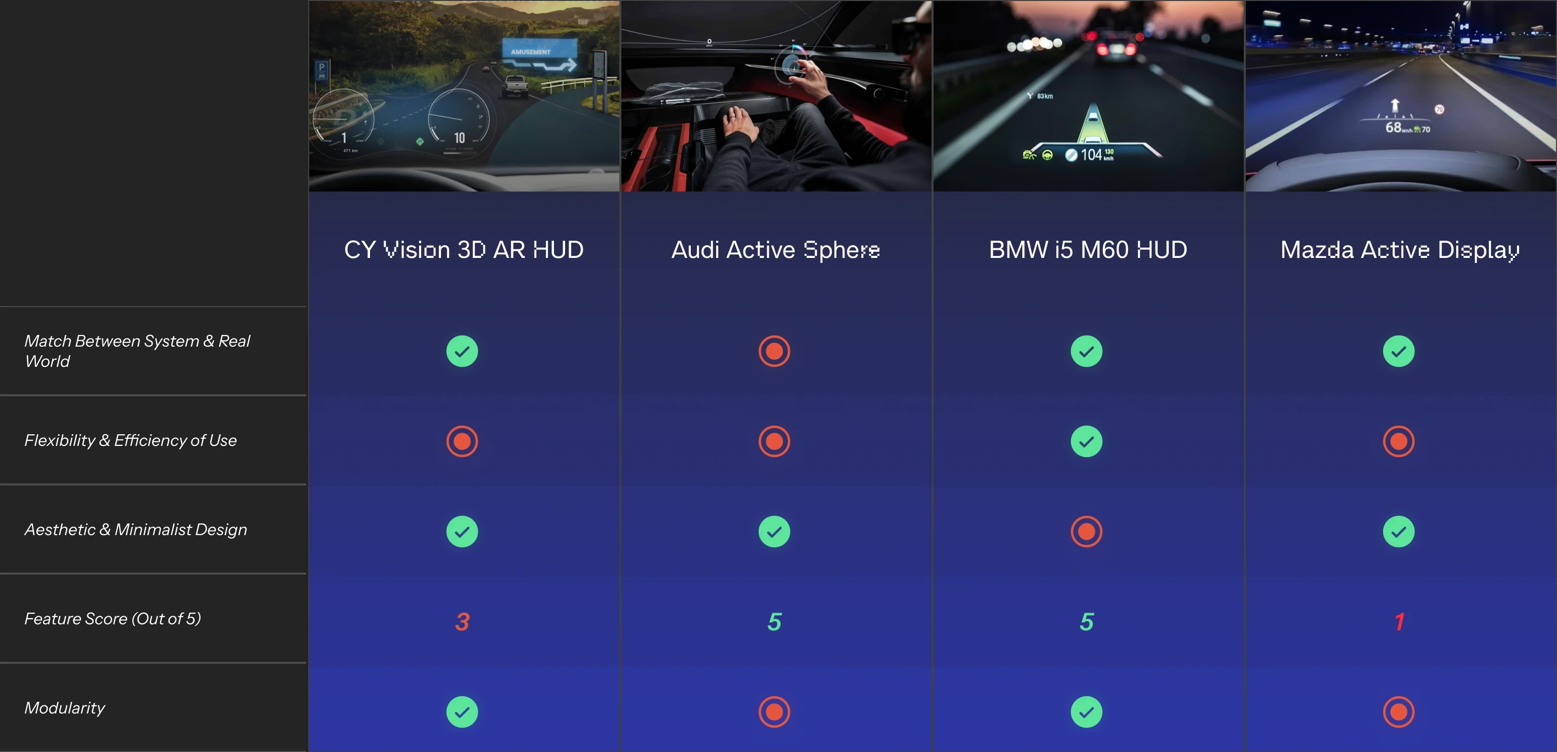
A key gap is the lack of balance between functionality and usability. Most HUDs were either feature-rich but did not follow usability heuristics like flexibility and minimal design, making them more distracting, or they were overly simplistic with limited functionality, such as no support for calls, navigation, or media control.
This showed a clear opportunity to design a HUD that combines robust features with strong usability principles, offering a modular and user-friendly experience that minimizes distractions.
Asking the drivers: Setup and research plan
Since this was a fairly new space for us, the team buckled down and swept through research papers that tackled complex topics about HUDs and more.
We understood:
What the distance between the eyeline and HUD projection should be
How much it costs to make dashboards
The rising trend where people use mobile navigation over maps in cars
Importance of colour contrast in HUDs to support day and night driving
This certainly helped us prepare questions we would ask in user interviews.


Left -Academic papers, Right- One-on-One User Interviews
Users agree; "Help me without distracting me"
We interviewed 5 experienced US drivers (3–5+ years) to explore their expectations and behaviors related to Heads-Up Displays. Our approach was rooted in the main problem statement: Convenience and safety while retaining the capacity to perform all primary and some secondary actions on the HUD itself, thus reducing reliance on the dashboard controls.

Users emphasis on:
🧘 Clarity over clutter
People prefer having navigation and speed information upfront. But they do not want to compromise on the minimalism of the HUD interface and express concerns about cluttering.
🤷♀️ Varying priorities
Interviewees had varying preferences regarding what they consider important. For instance, one individual prioritised RPM and wanted it displayed in the HUD, while others did not share this preference.
😨 Fear of distraction
Most drivers felt music control and phone alerts would be distracting, often leaving music handling to co-passengers and minimising its importance while driving.
The design begins…
Our design principles were:
Functionality > Simplicity
Usability in all conditions
Reduce anxiety at every step
HUD placement
A study shows that information in a HUD should be placed within 5–15 degrees of the driver’s line of sight to allow quick and easy access. Elements that might raise concerns about distraction should be positioned outside this range. Placing such content in the HUD is preferable to showing it on secondary screens, as it results in less distraction.

Primary data, like speed, RPM, navigation, fuel, and engine temperature are placed within the optimal viewing zone.
Meanwhile, content that appears without user initiation was kept outside this range, ensuring drivers only notice it when they choose to engage.
Visual Design (with usability emphasis)
Adding more features often caused issues with readability and visibility. This is one reason why many competitors chose simpler versions unless they found a way to overcome these challenges. We addressed this through practical design strategies.
We understood that popular AR design techniques like background blur and text vibrancy would not work for HUDs because they rely on projection, which behaves differently than standard digital displays. Instead, we applied effective solutions such as contrast shadows and used a car-specific typeface called Scandium. These choices improved readability and visibility while helping us maintain a minimal design.

Adaptive UI
The design is sensitive to changes in environmental lighting, not just the difference between day and night, but the overall brightness of the surroundings. To ensure optimal visibility, we created adaptive design variants that respond to lighting conditions. These versions adjust contrast, shadow hues, and modify color brightness and saturation to maintain clarity in any environment.
Intentional motion design
To address concerns about distractions on road, we implemented smooth transitions paired with audio cues that subtly signaled upcoming events. This approach helped them anticipate change, minimized unexpected interruptions, and helped drivers maintain control on the road.
Mimicking reality in the lab

Driver 1: Talking to us about the placement of elements in the HUD
Mistakes were made with our first tester. For starters:
Audio Feedback-
It adds great value to include audio indicators. Our first-user was unable to expect navigation cues, turn indicators and incoming cars. To better mimic real world, we included audio feedback.
Modularity-
One of the difficult design decisions was including modularity. Modularity = personalization. This was a non-negotiable to our user group.
Task 1- Take the correct exit
Our first scenario was to stress-test the HUD design in multilanes and exit situations; one of the most frustrating driver experiences called out by users.
Task 2- Analyse ADAS clues before changing lanes
The user was asked to assess the safety of a lane change using the ADAS data displayed on the HUD, while also anticipating a nearby vehicle approaching closely, as indicated by the same system.
Task 3- Take a call
The user was given the task to identify what the event is {incoming call} and take appropriate action while driving in the simulation.
Task 4- Change music while turning
The driver was asked to identify events on screen at the beginning. At the turning, the driver was given the task to change music while continuing to drive.
Results and Revisions
During testing, we noticed that some drivers prefer to move controls around like widgets in a homescreen. To accomodate a flexible solution for all, we prototyped modularity. This allows drivers to customise the HUD elements until it feels most comfortable and useful.
We saw a surprising reduction in distractions while users completed tasks; 1.56 secs lesser than a traditional HUD to be precise. This encouraged us to consider more realistic simulations and incorporating more features too.
It was also interesting to see that our testers associated the placement of elements in the HUD with the buttons on the steering wheel. This goes on to validate the Heuristic "Match between system and real world".
Keeping the learnings in mind, learning to use a HUD can feel like second-nature if designed right.
Kudos to us all 🧡
Thank you Prof. Irene Laotovska for being flexible to exploring unknown waters without restrictions in a safe design space.
Also thanks to Nabhi Shah, who makes the impossible happen :)


🔒 Entire Design Process
I discuss the juicy details of the design processes and many iterations in interviews and 1:1 chats. Feel free to reach out if you would like to know more. Excited to talk soon 👋