Chaos to Cohesion: Rebuilding Weee!'s Design System for Scale and Accessibility
2026
Design Systems
Accessibility
The problem
Weee! is a fast growing app expanding rapidly into newer markets with a huge design debt
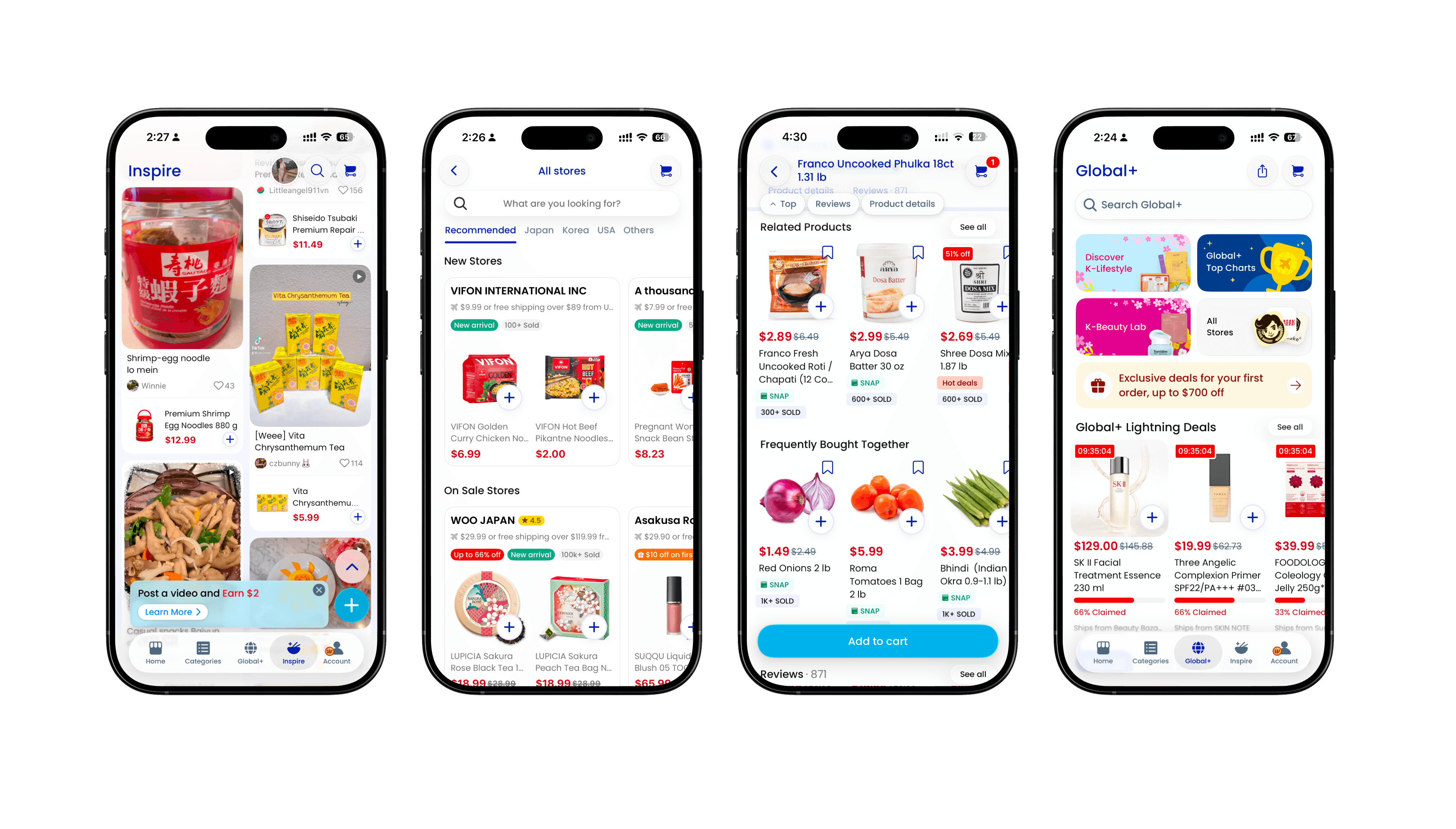
Weee's mobile interface
Founded in 2015, Weee! is America's largest online Asian super market. What started as a primarily Chinese grocery delivery service has grown in a multi-cultural platform spanning Thai, Vietnamese, Indian, Filipino, and many more cuisines. Today, it serves millions of users across the U.S. and is actively expanding toward the Middle East market next.
As Weee! scaled rapidly, its design team shipped fast. That speed left behind a trail of problems: mismatched colors, competing button styles, and components that existed in multiple variations with no clear rationale for when to use which one. It's the kind of inconsistency that accumulates quietly until you zoom out and realize the product no longer speaks with one design language.
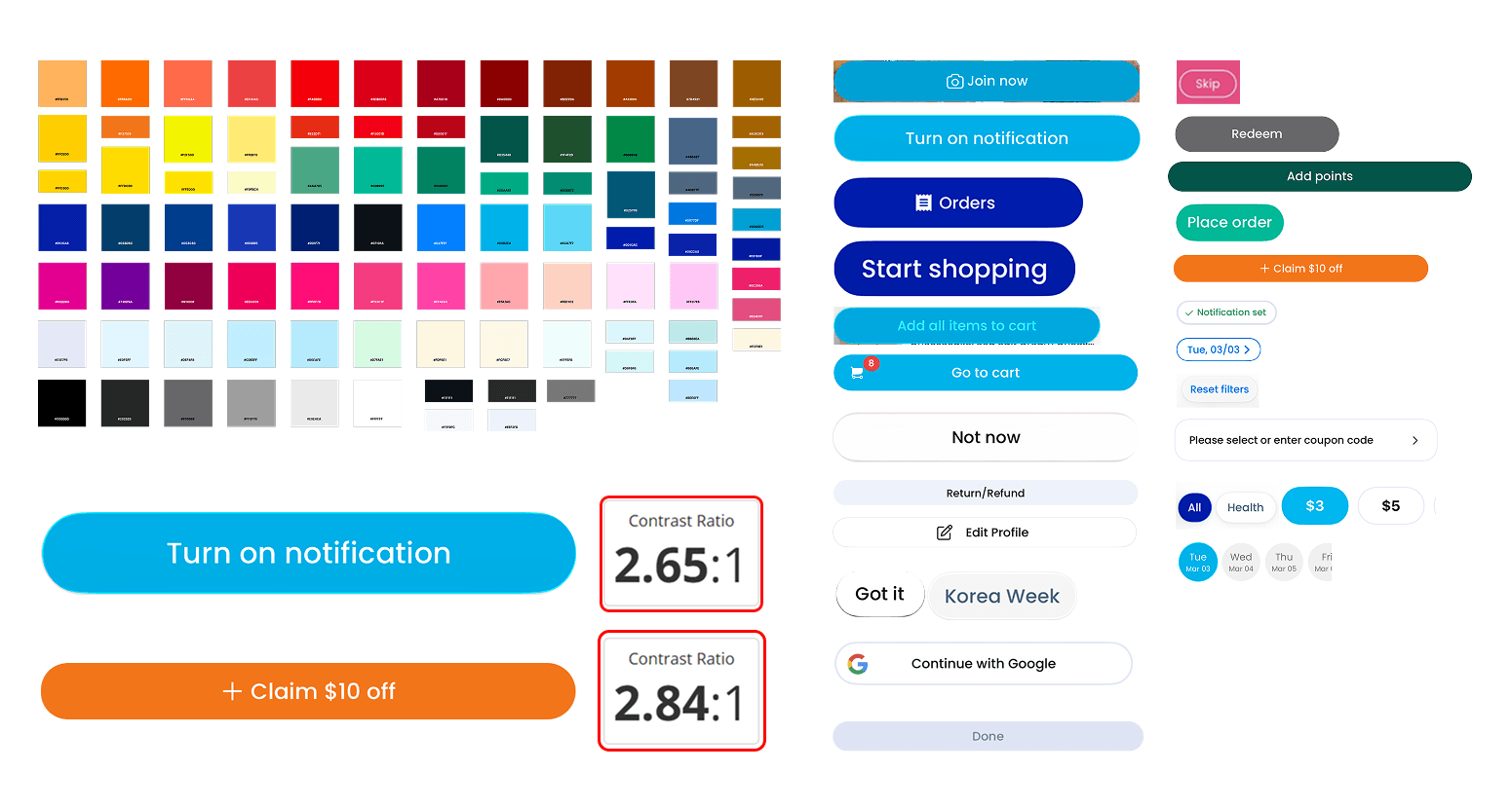
Snapshot of competing variants in the app
Why a design system?
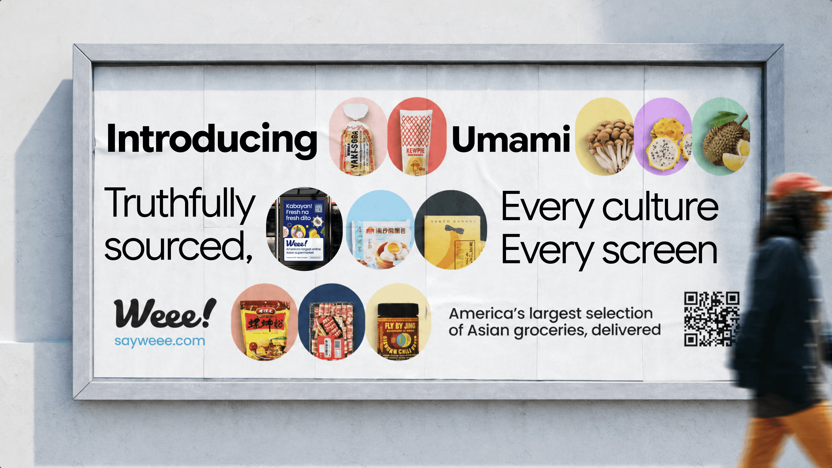
Umami – Weee!'s culture change disguised as a design system
While the app uses a UI kit (collection of brand images and colors, typography, tone, media kits, it still relies on the interpretation by different designers working on various product verticals functioning independent of each other. Without a design systems infrastructure, even the best teams drfit away. New designers introduce their own patterns and the product breaks!
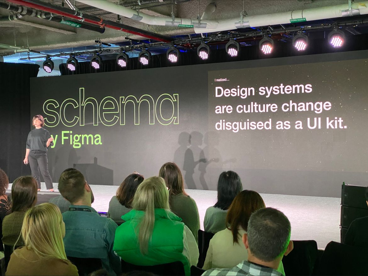
-Lauren Loprete
Final deliverables
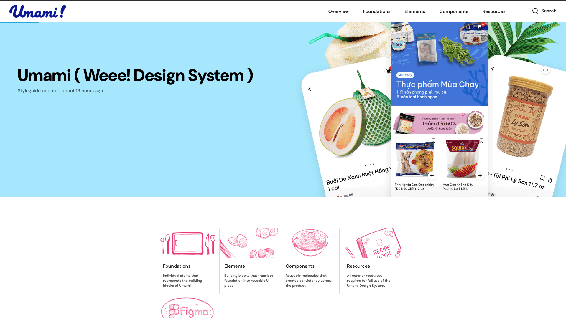
Meet Umami – the fifth flavour of great design
Umami describes a mild, deep taste that acts as an enhancer for overall dishes. Similarly, a design system cohesively brings together the elements and components to create one and multiple product experiences that work seamlessly together.
Umami is guided by a set of core principles, the system provides a unified way to build and scale products.
Design for All Users
Accessibility is a core requirement, not a feature or an afterthought
Be authentic and true
Components reflect their functionality, no dark patterns or visual noise
Build with flexibility in mind
The system evolves with Weee!, Components are made to be extended.
~~~~~~~~
Creating an inventory
Catalogued interface elements to identify inconsistencies and accessibility risks
To understand the interface, we went through the Weee! app systematically, cataloguing every visible UI element across its core flows: browsing, product detail, cart, checkout, account, and promotional surfaces.
What we found was telling: the same interaction (something as simple as a call-to-action button) appeared in at least six distinct visual forms across the app. Colors shifted without semantic meaning and accessible contrast ratios were failing in several key components.
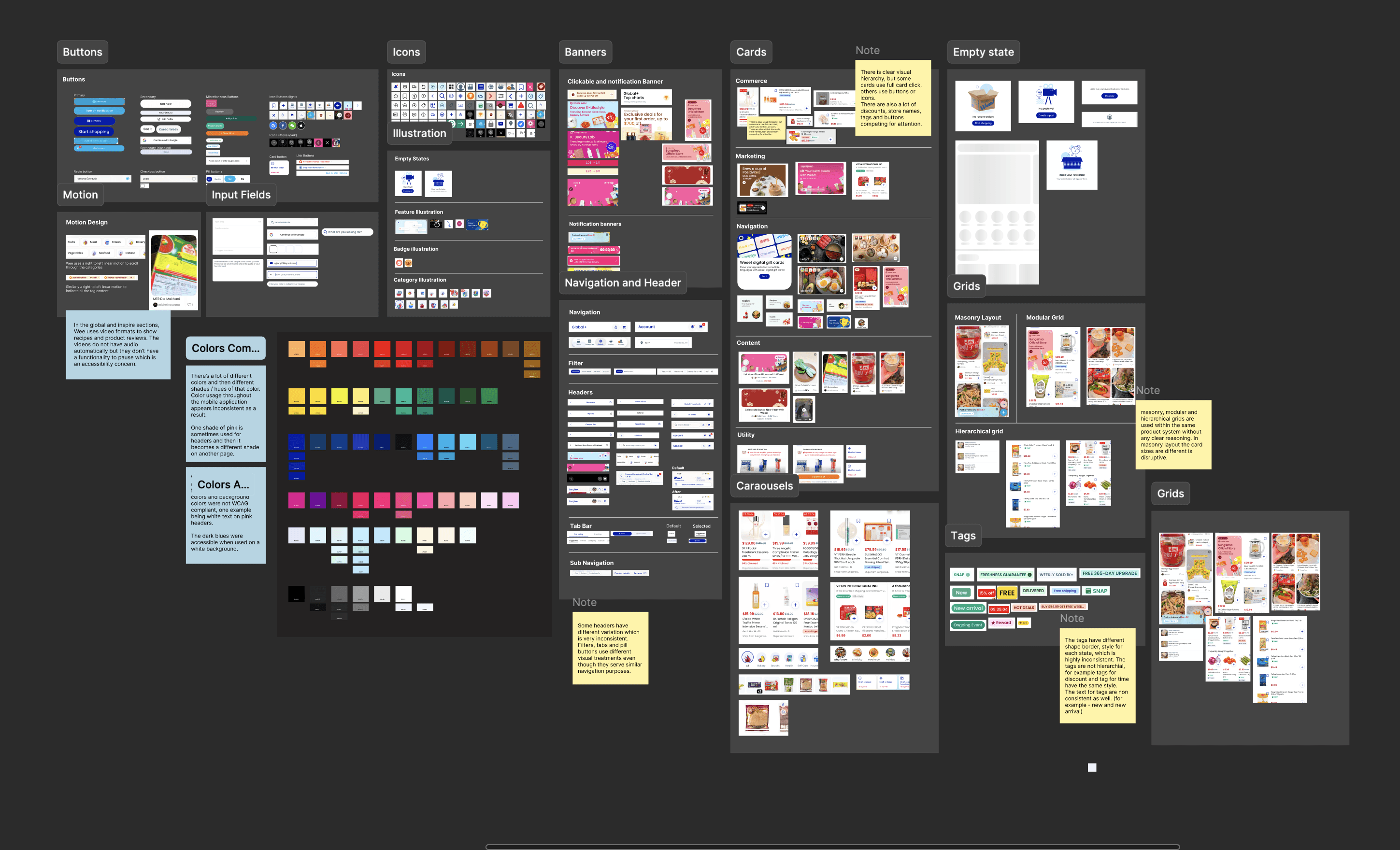
Snapshot of decoding the app
This inventory served two purposes. First, it gave us an objective foundation, a shared understanding of the problem and make the case for a design system. Second, it became the starting point for prioritising what to fix first in the design system.
Buttons
Carousels
Colours
Cards
Typography
Banners
Key findings:
Over 95 colors found in use, most without semantic meaning or token structure
12+ button variants with no documented usage guidelines
Contrast ratio failures on primary interactive elements (2.65:1 and 2.84:1 — far below WCAG AA's 4.5:1 threshold)
Multiple spacing and layout patterns with no shared grid system
No defined touch target minimum, critical for a mobile-first grocery app
Consistency isn't just aesthetically pleasing. It's cognitively efficient. Users who encounter familiar patterns; buttons that behave the same way, labels that mean the same thing, interactions that respond predictably, build trust faster and make fewer errors.
Setting up the foundation
Putting Our Ingredients Together
Token Foundation
Design tokens are the smallest unit of a design system yet significant. Instead of a hardcoded hex value of #001BA5, a token named color/interactive/primary carries both the value and its meaning. This distinction matters because tokens can be updated globally, themed, and shared directly with engineering.
What we tokenised:
Color — primary, secondary, semantic (success, warning, error), neutral, and surface colors
Typography — scale, weight, line height, and letter spacing
Spacing — an 8-point grid system (2xs through xl) providing consistent rhythm
Border radius — standardized across interactive elements
Elevation and shadow — for layered surfaces
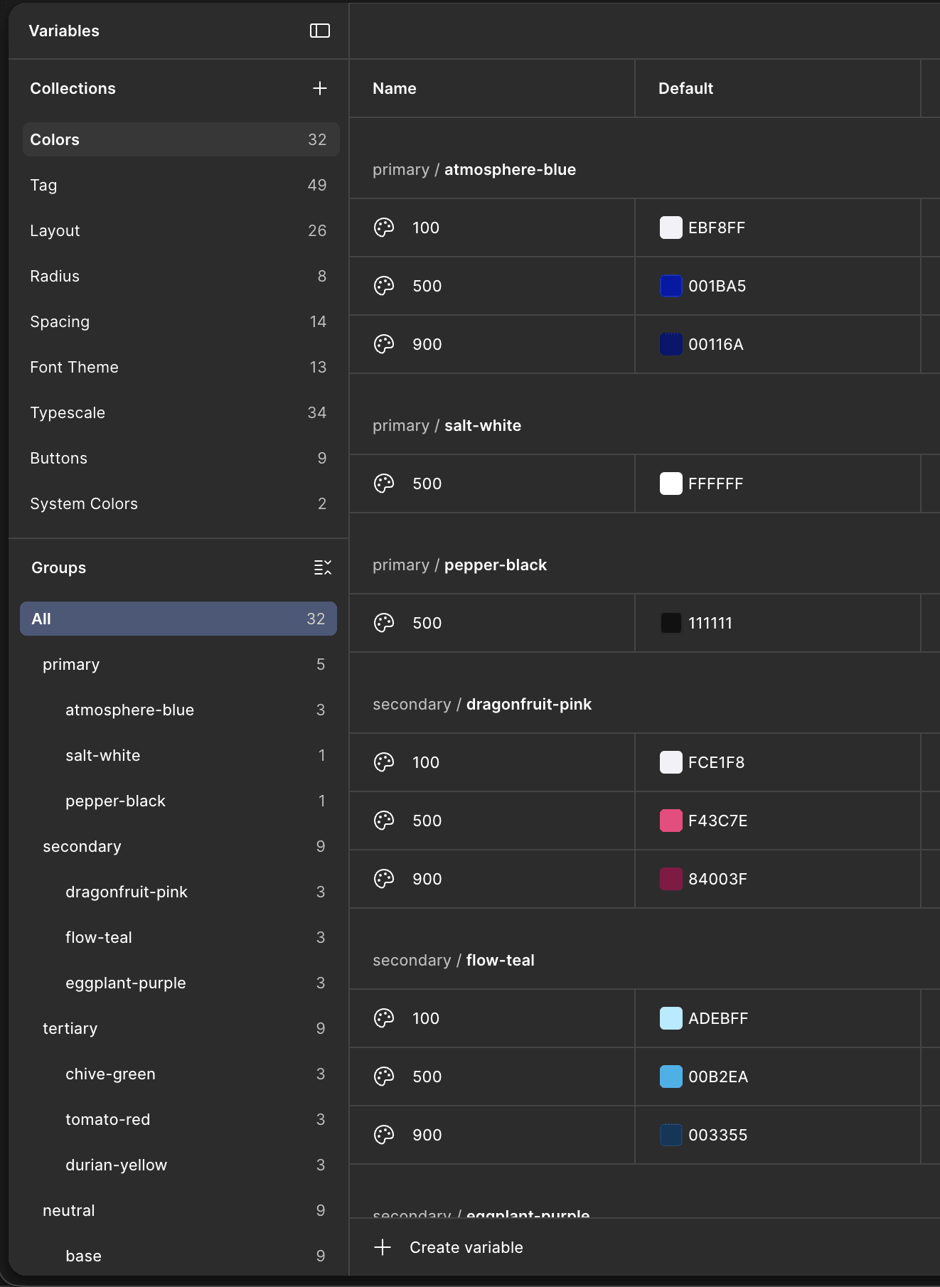
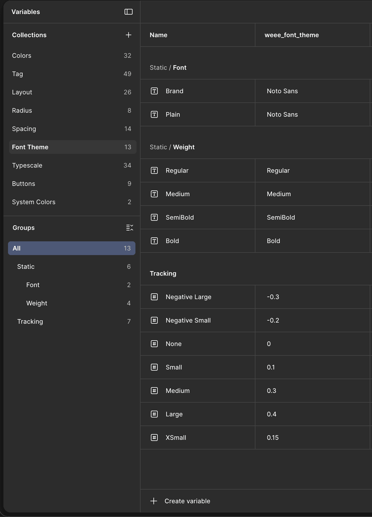
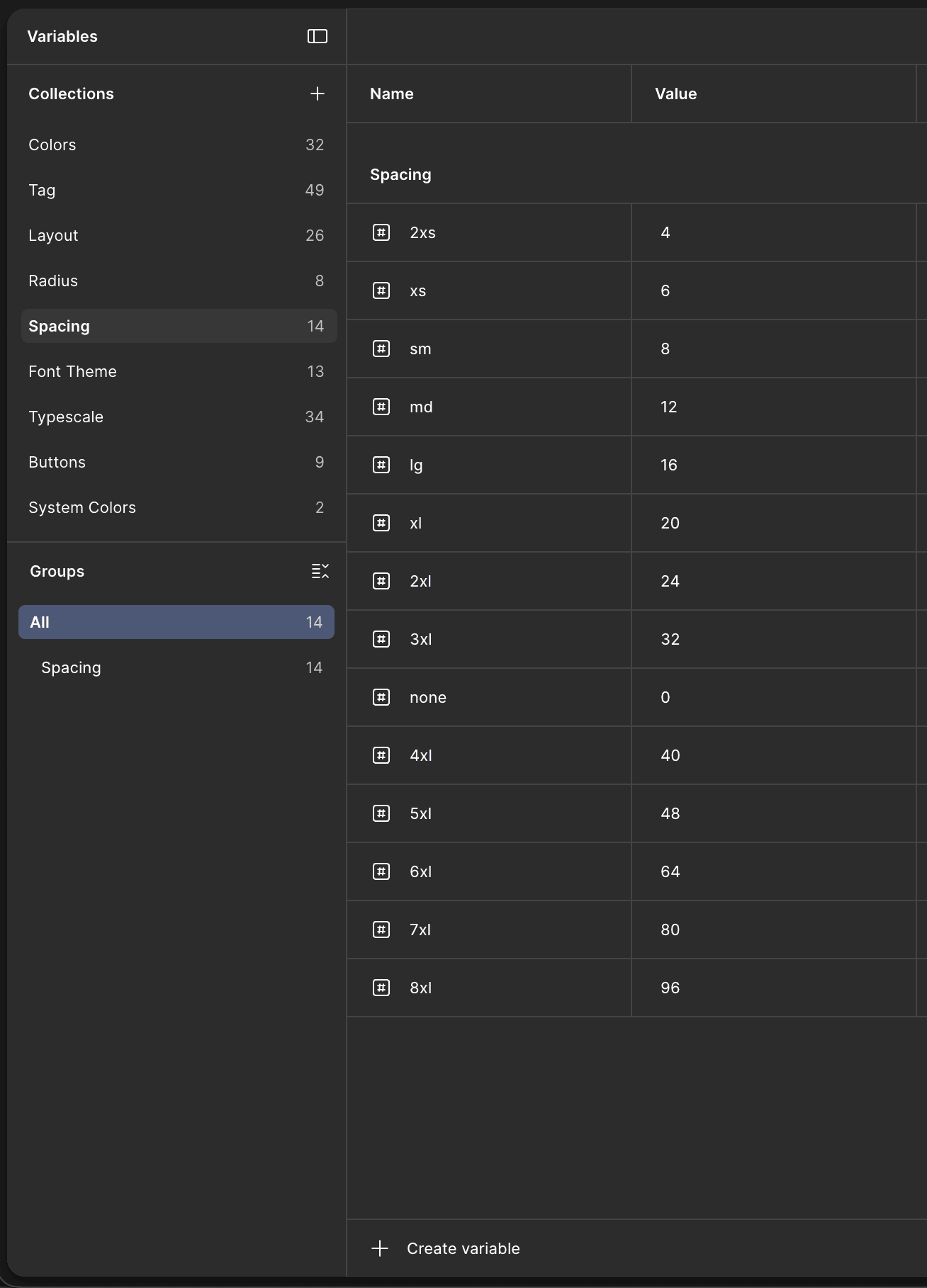
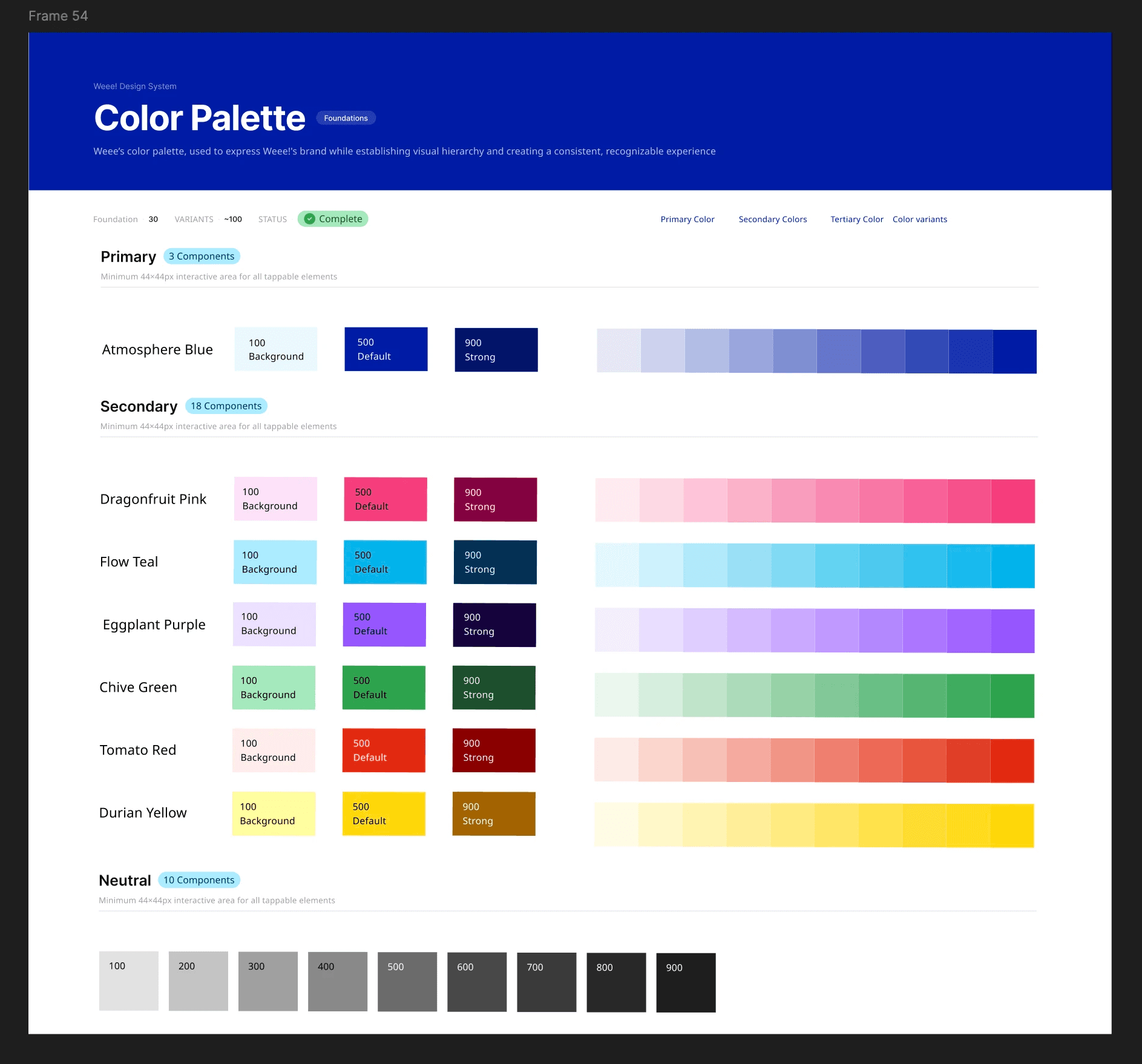
We adopted a category/role/variant structure (e.g., color/interactive/primary, spacing/md, radius/button). This made every token findable through autocomplete in Figma and created a direct parallel to how tokens would be named in code.
II. Creating atoms — buttons and text fields
With the foundation in place, we built the most fundamental interactive elements: buttons and text fields. These are the highest-frequency components in any product, and in Weee!'s case, they were also the most visually fragmented.
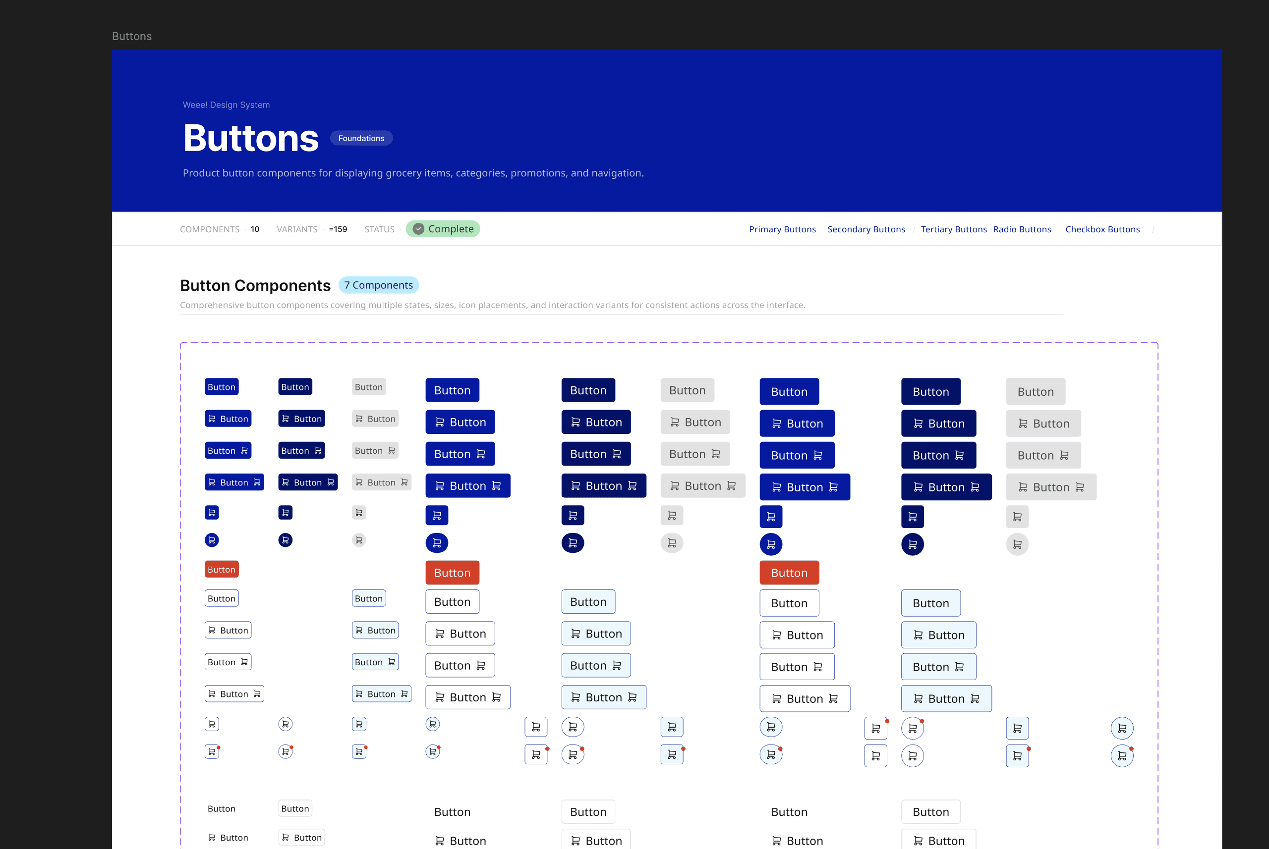
For buttons, we defined four types (primary, secondary, destructive, ghost) across four sizes (sm, md, lg, and icon), with documented states for every variant: default, hover, pressed, disabled, and loading. Touch targets were set to a minimum of 44x44px across all sizes, meeting both WCAG 2.2 accessibility requirements.
For text fields, we learned from research on form usability: help text lives outside the input (so it doesn't disappear as the user types), error states appear below the field (not inline), and label placement follows standard conventions to support assistive technology.
III. Building flexible components on top of atoms
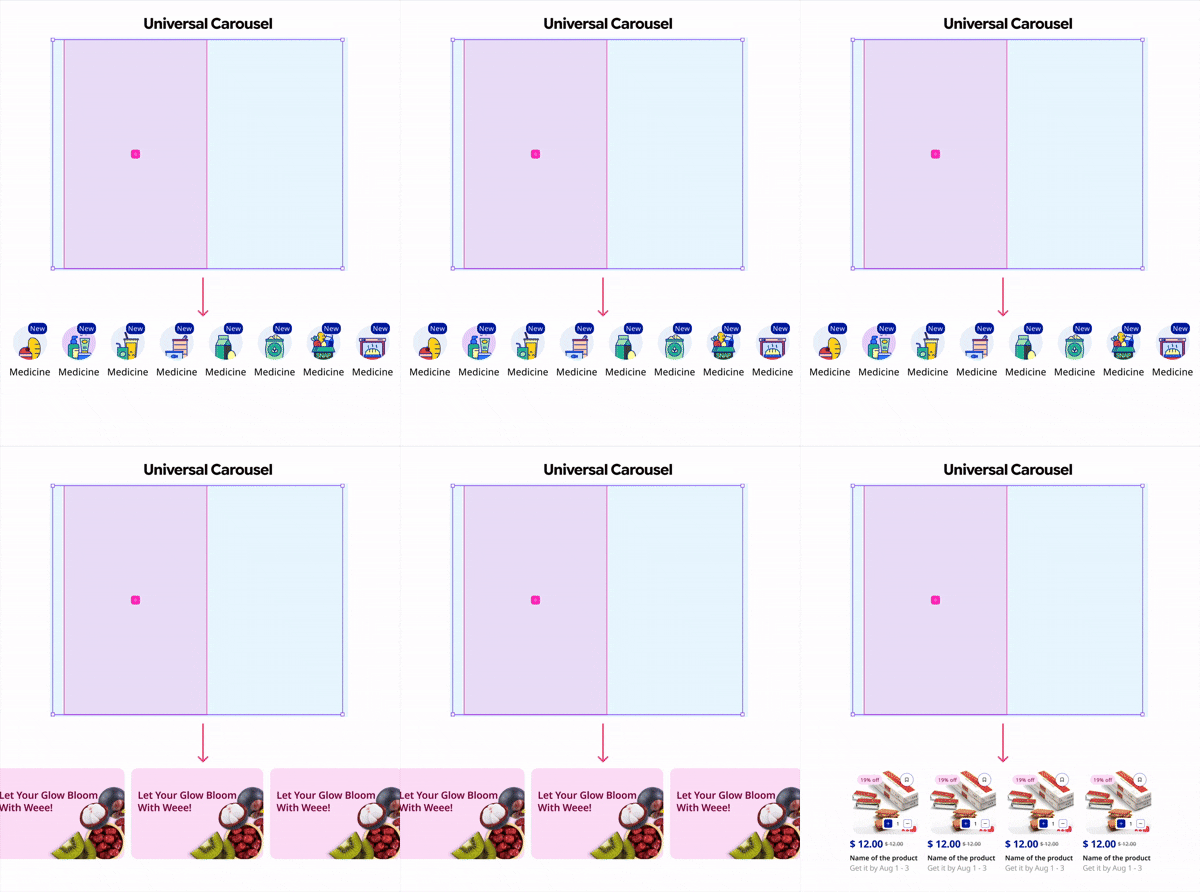
Atoms become molecules. Buttons and fields became cards. Cards became carousels. Carousels became page templates. We designed each component in multiple sizes and orientations to support the variety of layout contexts inside Weee!'s product: vertical and horizontal product cards, navigation chips in sm/md/lg, date selectors, filter sheets, and promotional banners.
One component to be particularly proud of is the Universal Carousel, a flexible container that can hold category icons, promotional banners, or product cards interchangeably. It reduces one of the most repeated layout patterns in the app to a single, reusable building block.
IV. Adding garnish — glassmorphism and background blurs
Once the structural work was solid, we explored how the system could express Weee!'s personality. This meant defining how elevation works in the product: the blur and translucency of overlay surfaces, the layering of promotional banners, the warmth of card backgrounds.
These decisions were documented as part of the elevation and surface system in Umami, so they could be applied consistently rather than re-decided on every new design. Good garnish makes everything feel more considered.
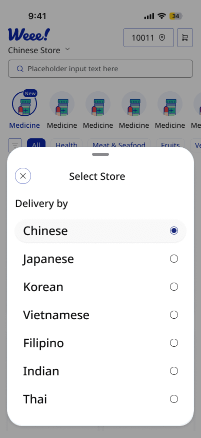
User Testing
Serving Umami to designers
Building a design system for designers means nothing if designers can't actually use it. We tested Umami by asking product designers in our personal networks to attempt a real task: recreate a Weee! product page using only the Umami Figma UI kit.
What we learned:
The most consistent friction point wasn't missing components. It was naming. Designers searched for things using different words than we had used to label them. Someone looking for a 'tag' searched for 'tab'. Someone looking for 'search' typed 'input'.
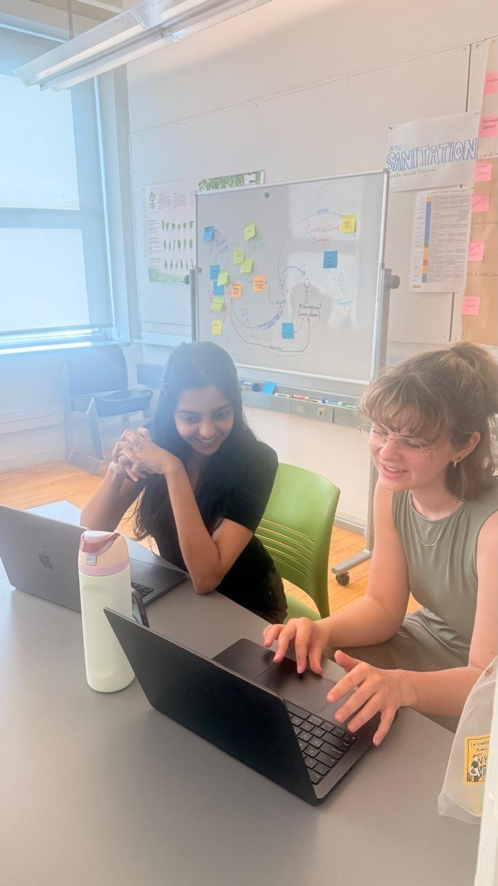
We also learned how more drag-and-drop components could be created since designers prefer working with ready-made elements that can quickly enable them to create screens.
Some key changes:
Separated out Nav Menu from tab bar to make it easier to udnerstand
Coupled "Search" as a variant inside "input" components
Drag-and-Drop elements
Created "Header" as a component by itself, instead of expecting designers to build it themselves
Created a universal component for carousels across the product (it can accomodate banners, cards, tab groups etc.)
Linear gradient for the Nav menu to stay be use with (this is a big part of the Weee! app and did not exist in our first version)
Final deliverables
Umami – A design system with documentation
After a couple of iterations, we could reap the benefits of the design system. Watch how a designer is able to build an entire screen in less than a minute, that's the magic!
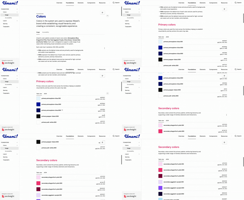
We also included documentation for easier onboarding for new designers joining the team. This saves a lot of time in KT and designers begin their work feeling supported and more confident than ever before!
Wrapping up!
Pitching Umami to encourage adoption
Through our pitch deck, we clearly communicated why a design system matters for a product at Weee!'s scale, one actively expanding into new markets and serving millions of users across cultures. The presentation walked stakeholders through the fragmentation Umami was built to solve, the business case for consistency and accessibility, and how Umami could evolve as a living system alongside Weee!'s growth.